Brand Kit — your visual identity in one place
Available from the Creator plan and up.
What's in the Brand Kit
The Brand Kit is the central source of truth for your visual identity. Settings → Brand Kit looks like this:
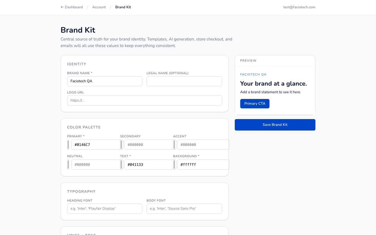
Six things live here:
- Brand Name + Legal Name (optional)
- Logo URL (or upload — PNG / SVG, max 1MB)
- Color Palette — Primary, Secondary, Accent, Neutral, Text, Background
- Typography — heading font + body font (50+ pairings supported)
- Voice + Tone — short statement the AI uses when generating copy
- Preview pane (right side) — shows how your brand renders before saving
How it powers your sites
When you use the Brand Kit, every new template you pick automatically inherits your colors, fonts, and logo. No manual recoloring needed.
The AI generator also reads your Brand Kit when creating new sections — so AI-generated copy, button colors, and section backgrounds all stay on-brand.
Setting yours up
- Inside the editor, click Settings → Brand Kit.
- Type your Brand Name + (optionally) Legal Name.
- Add your logo URL (or upload a file).
- Pick a Primary color. We recommend using the eyedropper on an existing logo if you have one.
- Optionally set Secondary + Accent colors for variety. If you leave them blank, we'll auto-derive complementary values.
- Pick a heading + body font. Some pairings we recommend:
- Safe + readable: Inter + Inter
- Editorial / luxury: Fraunces + Inter
- Modern tech: Space Grotesk + IBM Plex Sans
- Friendly / playful: Quicksand + Open Sans
- Click Save Brand Kit.
Per-site overrides
Each individual site can override any Brand Kit value. Handy for:
- Agencies managing multiple client brands — set per-client overrides per site
- Sub-brands under one parent brand (e.g. Aroma Café main site + Aroma Café Weddings sub-site)
- A/B testing alternative visual identities
The Brand Kit is always the default — individual site values win when set.
Tips for getting it right
- Use 2-3 colors max. Primary for buttons + accents, Secondary for backgrounds, Accent for emphasis only. More than 3 colors starts to look cluttered.
- Heading + body should contrast in style. Serif + sans-serif is the most reliable pairing.
- Logo URL can be a public PNG/SVG anywhere on the internet — including in another Faciotech product (e.g. your blog or main site logo).
- Color tip for African brands: consider warm-toned palettes (terracotta, deep gold, forest green) for authenticity. Cool blues work too but lean less "global tech".
Next steps
- 👉 Understanding AI quotas — the AI uses your Brand Kit when generating
- 👉 Choosing the right plan — Brand Kit available from Creator
- 👉 All modules overview